
Ranking Every Premier League Clubs Away Kit For 2026/27
Promoted sides not so sharp on these ones, Leeds produce a 10/10
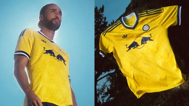
Photo: Leeds United
- Hull
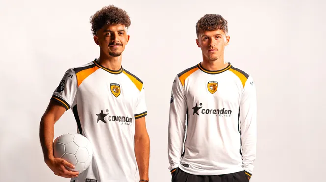
Photo: Hull City
This kit stinks, plain white with a weird shape of black and yellow at the top. Ugly sponsor, and the badge in the middle, this kit is awful.
- Tottenham
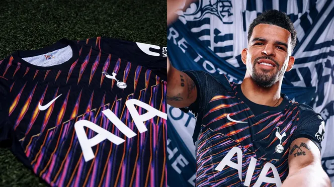
Photo: Tottenham Hotspur
Tottenham again with this kind of away kit design. Ugly colours and design and it's as simple as that. This kit sucks.
- Sunderland
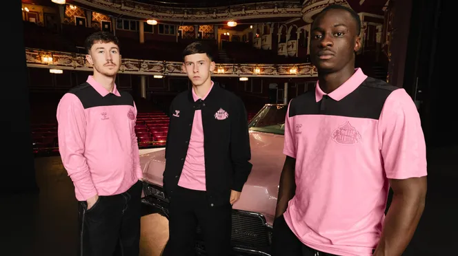
Photo: Sunderland AFC
Number one home kit, but this away kit looks very bad. Pink collar into a weird black shape, then back to pink where you can't see the badge. This kit is trying to be too clever and it hasn't paid off.
- Crystal Palace
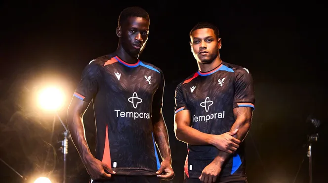
Photo: Crystal Palace
A nice pattern from a close up, but from a far this looks like a wetsuit with a bit of blue and red on it.
- Aston Villa

Photo: Aston Villa
Actually a nice kit apart from one detail. The centralised badge. It's very hard to make it look good and this isn't one of them. Had potential this kit.
- Brentford
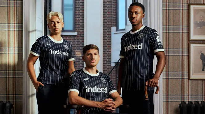
Photo: Brentford
Randomly inspired by the movie: The Kingsmen, this kit is clean and basic, but gives off the vibes they were going for of a suit. It doesn't suit ironically.
- Chelsea

Photo: Chelsea
The gold badge stands out well on this kit, but is a very plain and boring kit. The pattern on the neck looks very weird.
- Coventry
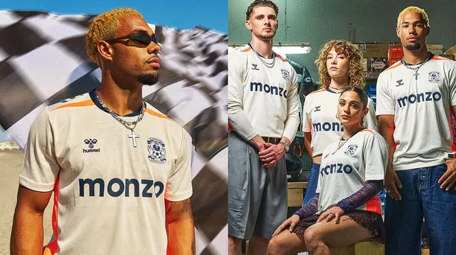
Photo: Coventry City
A rare cream kit, the subtle pattern makes the front look slick. What somewhat ruins it is the random red and orange on the sides and top.
- Ipswich
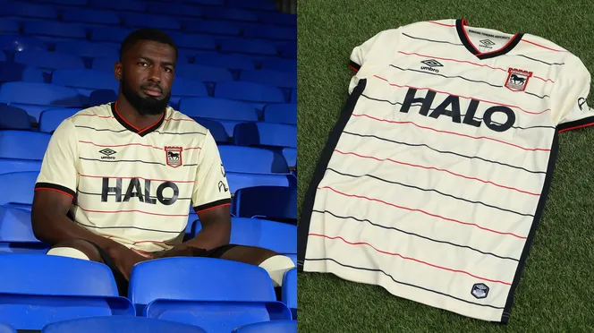
Photo: Ipswich Town
Simple but average looking kit. Very similar to Leed's home kit, the horizontal lines look a bit funny.
- Brighton
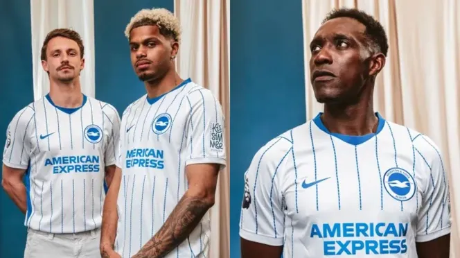
Photo: Brighton and Hove Albion
The same as their home kit only with the colours reversed. Simple, nothing crazy good or bad.
- Nottingham Forest
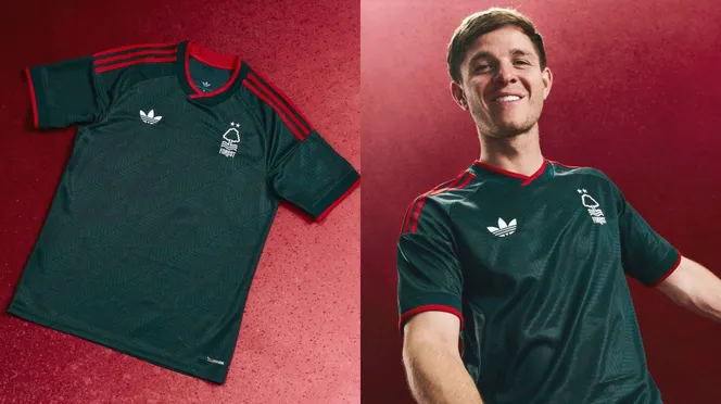
Photo: Nottingham Forest
Had to put this right in the middle because I can't decide what I think of this kit. Simple and striking look with the dark black and dark red, but it looks like a training kit more than a proper one.
- Everton
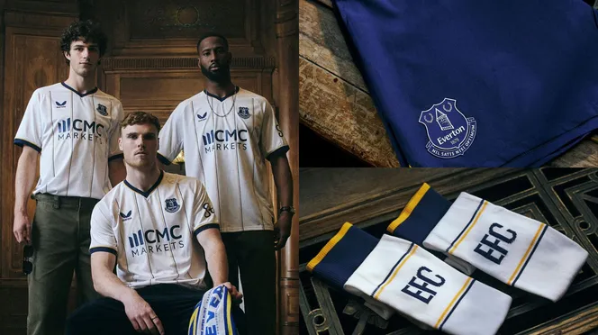
Photo: Everton
Simple, clean, with nice symmetrical stripes. A solid away strip for the Toffees.
- Newcastle
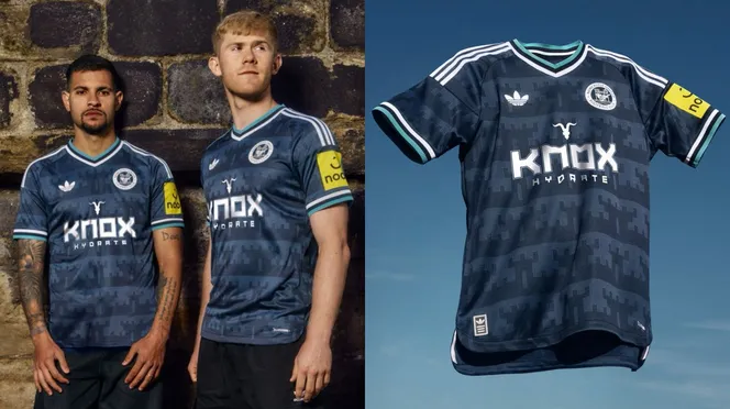
Photo: Newcastle United
Way nice than their horrendous home kit. A nice pattern, old school Adidas logo, and Newcastle badge, Newcastle fans can at least buy this jersey instead of their barcode of a home kit.
- Liverpool
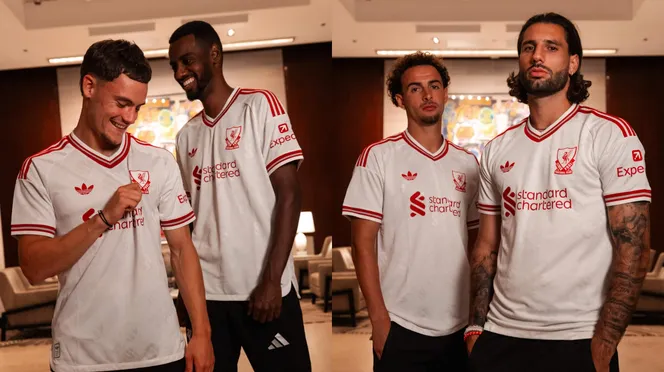
Photo: Liverpool
Old school Adidas logo, and Liverpool badge. This kit is basic but striking, a good season for Liverpool kits.
- Fulham
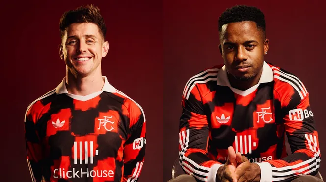
Photo: Fulham
The old Adidas logo, with a very unique red and black pattern on the front, this kit could've been top three. The only let down is the collar is ugly.
- Bournemouth
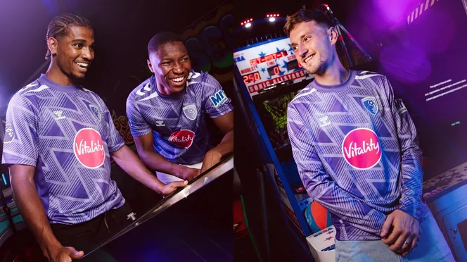
Photo: Bournemouth
A polarising kit that's for sure. But I like it, very much like a retro keeper jersey with the zigzag pattern. Hard to pull off a purple kit, but Bournemouth have done so.
- Manchester City

Photo: Manchester City
Way nicer than their home kit, the gold text and badge stands out super nicely against the black colour base. No nonsense solid kit.
- Arsenal
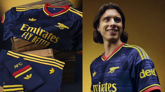
Photo: Arsenal
Old school Adidas logo, yellow stripes pop, and a nice pattern. This kit is a very good one for the Gunners.
- Manchester United
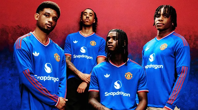
Photo: Manchester United
Identical to the home kit which I like, but in blue. Manchester United have some of the best kits this season.
- Leeds
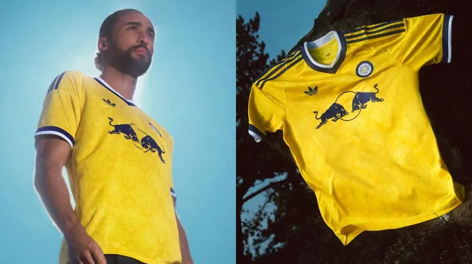
Photo: Leeds United
This is the best kit of any kit so far, home, away, or third. Bright yellow, cool pattern, old school Adidas logo, old school Leeds badge, sponsor works well, nice touches of white and dark blue around the neck and arms. This kit is 10/10.
Comments (0)
Sign in to comment, like or dislike.
Loading…